Lee Williams Product Designer

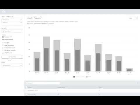
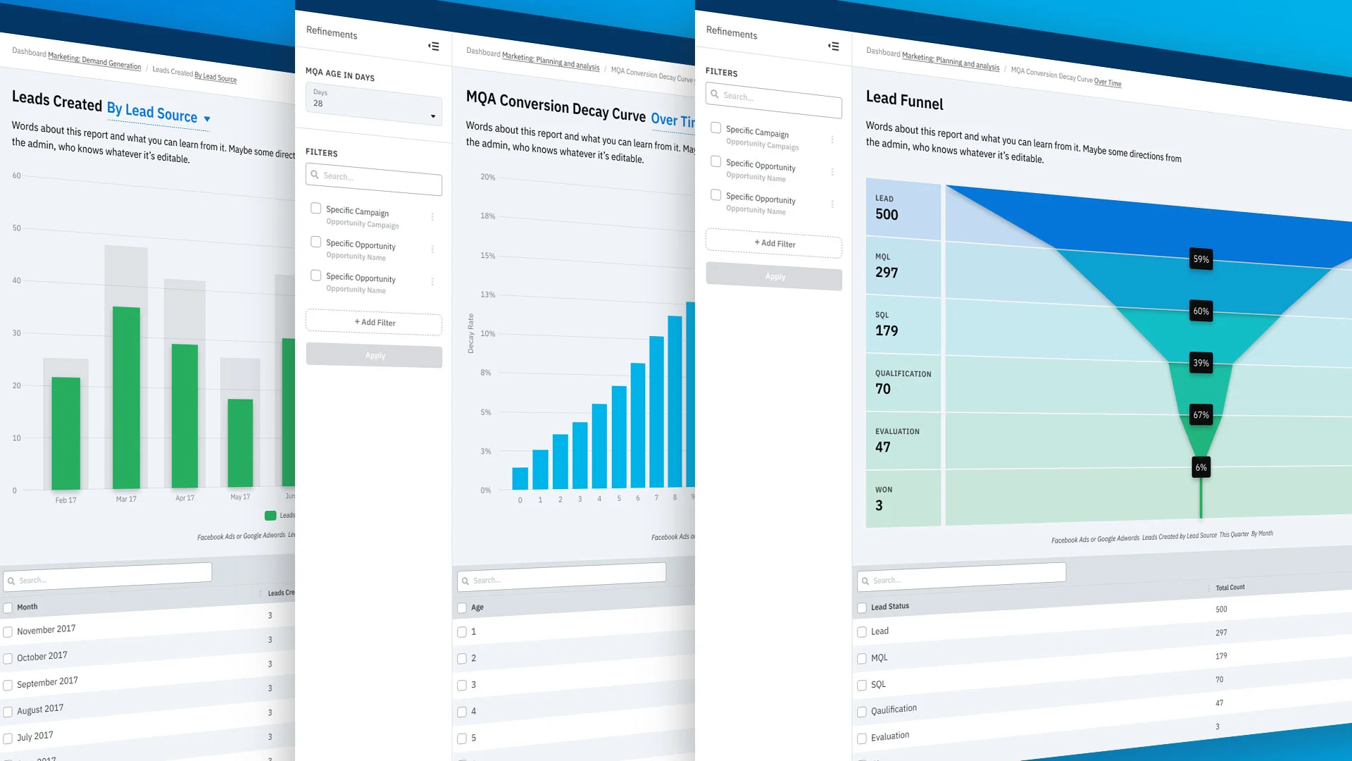
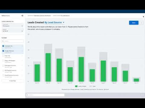
In early 2018 InsightSquared (IS2) launched a series of dashboards around marketing analytics to test the waters of moving into Martech. IS2 until then had been exclusively built off Salesforce data. The dashboard showed some interest so the businessdecided to investigate creating a series of marketing reports that could potentially utilize the custom report builder tech IS2 had been developing. Working closely with a PM I conducted a series of interviews with various clients who had expressed interest in wanting marketing reports in addition to their sales reports and developed a bit of an evolution of IS2’s current design language as a kind of POC for what a new design and reporting architecture could achieve.
WHAT
Forecasting is integral to every business. Businesses must be proactive with their budgeting and can’t wait till a period has closed to determine what they can spend or save. This task is surprisingly complex.
WHO
Through extensive research and interviewing our internal and external sales teams, we discovered three primary personas: sales reps, sales managers and heads of sales (C suite / VPs).
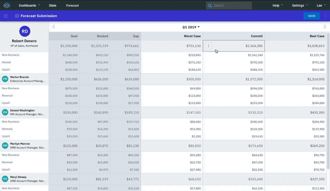
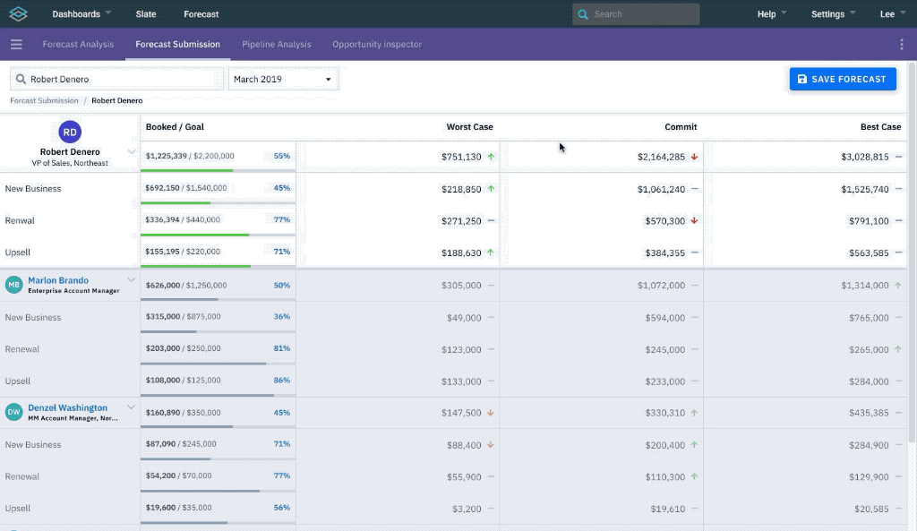
Reps intimately know the opps they’re targeting in a given period, so forecasting is primarily a tool for them to communicate upwards. Reps enter a commit: their prediction of what they’ll close in the period. Their commit can be broken into multiple categories: worst case (a very conservative number, often what they’ve already booked), commit (what they’re most confident they can close) and best case (their stretch goal). Business have all kinds of commit categories, so that aspect needs to be configurable per client.
Sales managers oversee teams of reps and teams of other managers. Their primary concern is committing a roll-up of their reps’ or teams’ numbers. They may need to override some of their reps’ numbers, knowing they’re overly optimistic or conservative. Managers could use guidance for how accurate reps are or how likely opps are to close.
Heads of sales oversee the entire sales organization. Their primary concern is achieving the company’s broad sales goals. They need to know how the period is tracking to their goal, what’s been booked, the gap, and the likelihood of closing it. In addition they may want to examine managers or even individual reps to track key opps or certain managers’ goals. Heads of sales are also looking at future periods and need more predictive analytics.
HOW
This is a complex workflow that needs to work for multiple personas. My thesis was that to achieve this level of transparency throughout the sales hierarchy, we would tie opps directly to a commit number so any user could access a commit to see its full details, including how it might have changed over time. In addition, surrounding reporting will enable users to make more informed decisions about their commits.
I started with simple mapping. Users will start from a forecasting dashboard that provides a quick summary of their current commit, pipeline, key opportunities, forecast history and forecast predictions. From that dashboard they can drill to any of those pieces.
We can’t tackle all those pieces at once so we had to decide where to start. We already have pipeline analysis reports, opportunity reports and forecast history reports in InsightSquared -- they’re just not tied to a dedicated workflow. Those would need revision for the end product, but what we lacked and would later be the basis of much of that surrounding information would be capturing users’ commits, so that’s where we would start.
I gathered information from our services team, user interviews and the product team’s thinking, created a list of user requirements for making a successful commit and began wireframing.
My initial wireframes were focused on how a user could include opportunities directly in their commit. Reps would have a good idea about why they were committing an opp, but managers would need further background about those opportunities. My initial designs a had mini pipeline analysis table at the bottom of the page, but this quickly became burdensome from a responsiveness perspective. In addition it was difficult for people to understand where they could manually change the number. An opps raw value may be $20,000, for instance, but reps often discount that price to help close the deal, so they’ll want to manually override their commit to reflect this.
I created another iteration that organized opps into a sidebar that was structured more like a receipt or calculator. Opps would be included and could be manually overridden.
With this version we began testing to get user feedback. A couple things were wrong about the information included for each opp, selected opps would hide the opp score, users weren’t quite sure what search/select input at the top of the sidebar did, users wanted to be able to collapse employees to simplify the view, along with other smaller comments.
With all this in mind we revised and tested a few more times and we’ve arrived at this solution.
During my fellowship at the Consumer Financial Protection Bureau, my time was spent helping rebuild and redesign the CFPB’s entire online presence. This video was created specifically for the career section. The federal hiring process is byzantine and the CFPB was still new and doing a lot of hiring to get up to capacity. We felt the hiring process needed to be explained up front and as clearly as possible to get more candidates unfamiliar with federal hiring through the pipeline. You can see the career section here. Another designer and I worked specifically on this video. We wrote the script, did the initial storyboards, animated, edited and directed the voice over artist. It turned out great and I was impressed they even let us keep the parts that poke fun at the arbitrary nature of federal hiring.
The Consumer Financial Protection Bureau had existed for less than two years when I started. Its website and applications had all been rushed into existence to fulfill their requirements by Congress.
The bureau had a bare bones website. It wasn’t responsive, it didn’t really reflect their branding, and it was difficult for users to find the help services the bureau provided. You can view the old site with the Wayback Machine:
The team I was assigned to was tasked with revising and modernizing consumerfinance.gov to make it more inviting, easier to discover their services and content, to reflect the brand direction, and create an accessible and scalable pattern to build on. The site has changed somewhat since my time at the CFPB but you can largely see the legacy of our work still represented at https://www.consumerfinance.gov/
I created this cute 404 page tech demo. I used canvas and created the artwork. It never got used but I still think it’s a lot of fun!
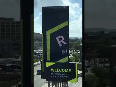
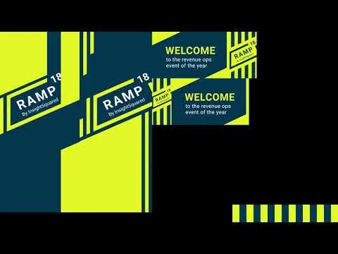
InsightSquared’s second annual conference was hosted at the Westin Boston Waterfront conference center. As part of the many design needs for signage I got to create the motion graphics for the large marquee in front of the building to welcome guests. The template the Westin sent over was unique. The marquee itself has two faces that wrap and are composed of four major screens. The large vertical “screens” are actually LED poles so I had to experiment with what level of detail they could recreate legibly. Another constraint was that the two traditional screens couldn’t feature any motion due to some Boston law or ordinance. It turned out great and looked fantastic in person.
InsightSquared’s new marketing product is an opportunity for the company to evolve. We’ll be building this effort with all-new front end technology and using it as a launch pad for evolving our product’s design and UX patterns.
We’ll be trading out Roboto for IBM Plex Sans, a unique typeface that’s not nearly as ubiquitous. Most sans serif fonts are so minimal it can be difficult to distinguish some letters from one another, such as I (capital i) from l (lower case L). Plex utilizes a slab serif on select letters to avoid that problem, which is both functional and creates a unique look.
The new color palette will have greater saturation and a bevy of color breaks so we can utilize color in more ways within the product while ensuring a high level of color accessibility for visually impaired users.
I’m utilizing an 8pt grid system, which should be easy for our engineers to implement and create consistent visual rhythm throughout the application.
I’m also providing guidance for how our components should be implemented as well as clear examples of how they should be utilized.